
In February 2020, I was called into a super secret meeting that defined the next chapter of my career. My company, CenturyLink (CTL), known primarily as a consumer telecom provider, was tundertaking a complete transformation. We were rebranding as Lumen Technologies, pivoting entirely to B2B enterprise solutions, and positioning ourselves as a leader in the 4th Industrial Revolution. The project codename: "Larry."
This was huge. We had the opportunity to rebuild the entire structure of the business from the ground up, to (literally) make a new brand that fit what we were and had to sell, instead of forcing ideas to fit old CenturyLink. We could make Lumen what we wanted CTL to be.
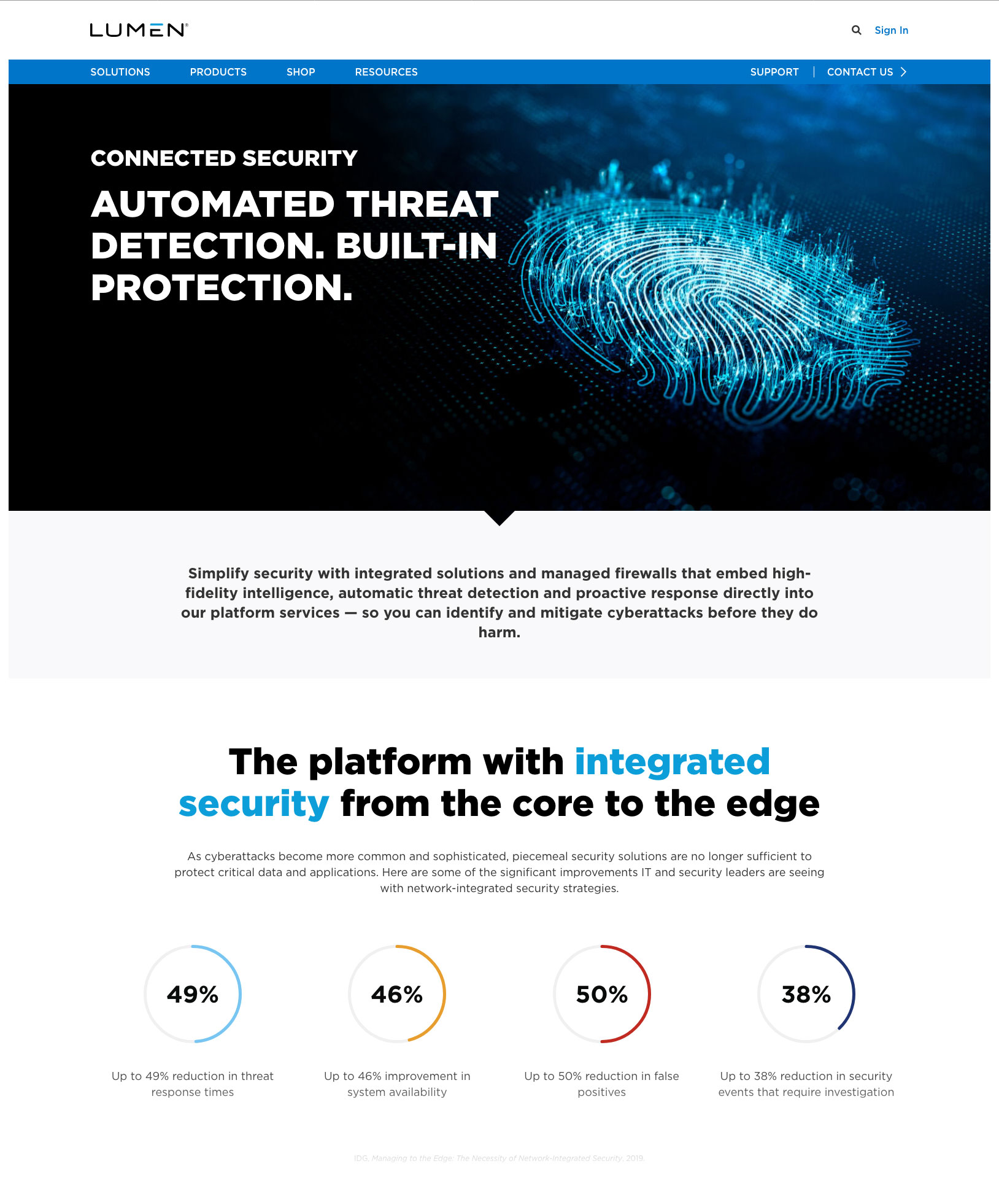
But this was far more than a typical rebrand. Lumen was a strategic leap to focus exclusively on B2B, shifting the residential market to a subsidiary keeping the name CenturyLink. We also had to create connective tissue between our products under the new banner of "The platform for amazing things." Even the name signaled our direction: After years of CenturyLink's "Night" aesthetic (described in brand guidelines as "vibrant, bold, luminescent and professional" and featuring people in dark offices at night, faces lit up by their devices), Lumen literally stepped into the light.
The timeline? Seven months to launch. For context, a rebrand of this scale typically takes 18 to 24 months.
As Manager of Digital Design, I defined the look of Lumen. That meant:
The stakes were clear: we had to ship a complete Fortune 500 rebrand—new name, new brand, new strategy—in seven months (I joined the project two months after initial planning began). And we had to do it during a global pandemic.
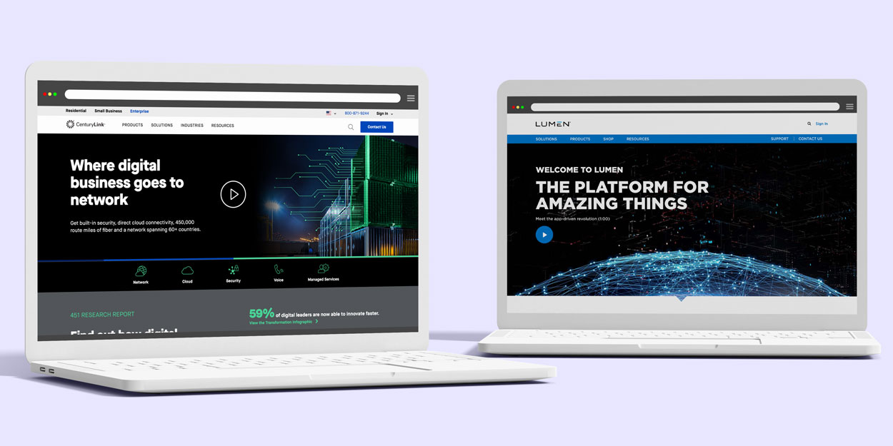
CenturyLink was perceived as an old-school telecom, known primarily for consumer offerings: internet, phone, cable TV. The B2B division was seen as an add-on, maybe even an afterthought. Not a business that stood on its own.
Our target wasn't a new audience, but a more focused one: IT decision makers (ITDMs) at large and medium enterprise companies. We needed to convince them that this "consumer telecom company" was actually a serious B2B technology partner.
COVID-19 hit in March 2020, pretty much when we were starting. None of us had been through a pandemic before, so there was a lot of fear and confusion, not to mention the terrifying possibility of getting really sick.
Our team was already remote, so we didn't have to mask or "social distance" at work, but we had to adjust to other teams dealing with the confusion and chaos of suddenly going remote.
People were nervous and freaked out, but also genuinely excited: A rebrand is a designer's dream project.
The launch date was non-negotiable. We tried several times to adjust the timeline, but ads were already bought and schedules were made, so senior leadership was firm. We relied heavily on project managers to keep things moving as some deadlines were missed or pushed back, but overall we stayed on track.
Personal note: I had to move from Minneapolis to New Haven, CT, for eldercare in September 2020. I was literally on the road, moving, the day of the launch. Between the pandemic and this major life transition, the launch wasn't as celebratory as I wish it was, but the work itself was something to celebrate.
Of course things happened that we didn't expect, and that weren't exactly helpful. Here are two:
About two months in, a designer discovered our primary Lumen blue was identical to a another big company's brand color. It was too late to change. I advocated to keep it, arguing our usage was completely different. Leadership agreed.
We didn't have a standalone icon for the company. I worked with a designer to stylize the "E" from the Lumen wordmark. Legal flagged it as similar to another company's mark. I made the case for approval. Legal and senior leadership approved. That "E" became an informal icon for years.
I organized my 12-person design team strategically for the rebrand, while also finding time for ongoing CTL work:
The Creative Director was the primary contact with outside agencies and owned most overall design feedback. I took ownership of web design after they delivered initial layouts—their first version was way off, very magazine-like, looked great at one specific browser width but wasn't dynamic or responsive. After detailed feedback that I drove, they came back with a much more realistic design that leadership approved.
The outside agency created the logo, started our palette with a few colors, created an initial web page layout, and offered some type suggestions. I took those ideas and we fleshed them out into a complete system:
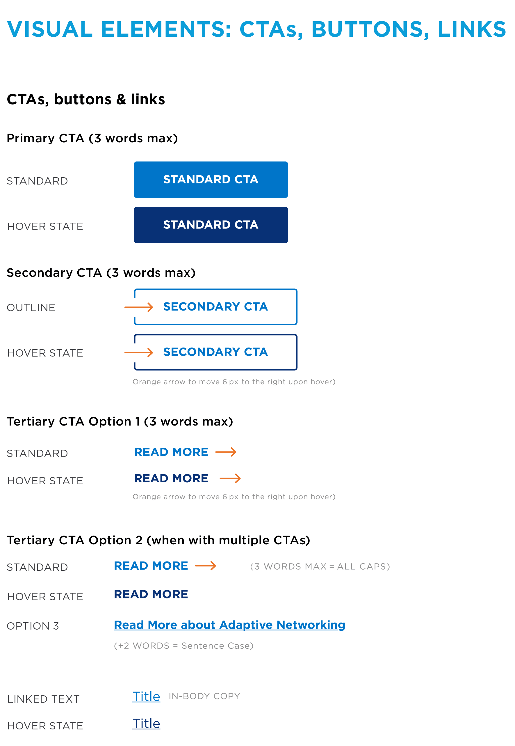
Component design helped define the new brand, so there was a lot of scrutiny. When we find the right designs, we had to define, document, and make everything scalable across 1,300+ assets.
The outside agency provided a list of suggested fonts. I reviewed them with the Creative Director and VP of Marketing, and we narrowed it down to Raleway and Gotham. I preferred Raleway, but the shape of the "w"—looking more like two overlapping "v"s rather than two "v"s joined at the top—felt too distinctive for the VP. He and the CD chose Gotham.
It was a good choice: different from CTL's Maison Neue, different from competitors, fresh and clean, but not so distinct as to distract.

The shift from CenturyLink's "Night/Dark" look to Lumen's bright, human-centered photography was huge and welcome. The designers and I struggled to find the right night images that didn't look forced, unrealistic, or like a bleary, late night at the office. One designer summed it, that finding a good image of a farmer using a device at night for a ad was pretty much impossible. We really enjoyed defining out new, bright and bold style:


Photography Guidelines My Team & I Implemented:
There was zero pushback on moving from CTL's dark look to Lumen's bright aesthetic.
We primarily used stock photography, together with custom shoots from the outside agency. However, their shoots created challenges. Their model choices were fine, but wardrobe choices were consistently bland with a lot of beige and barely-pastel colors. However, they provided their selections at the last second so were often stuck with what we got. Some images also had really sharp contrast that didn't match our other photography. We made it all work, but it took some major editing, and directly led to me directing our own custom shoot the following year.
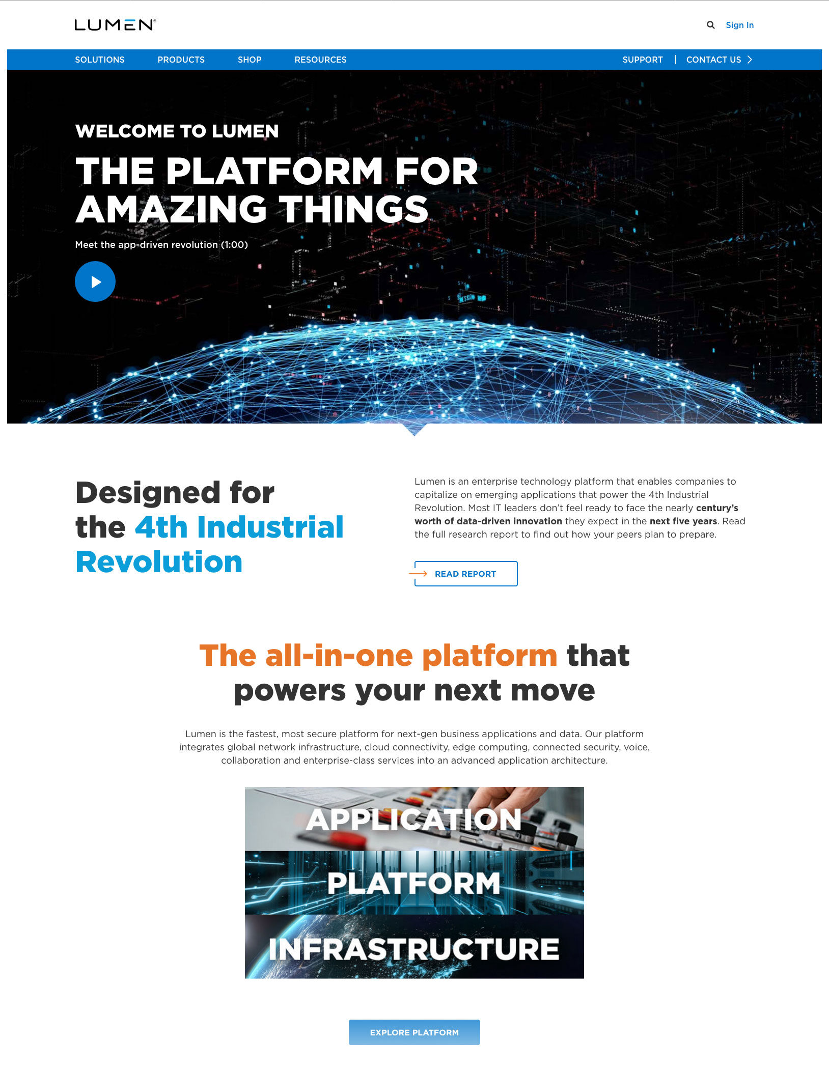
"The notch," as we called it, was a small triangle extruding from the bottom of page hero images, pointing downward. We felt it served as an elegant invitation to scroll down and learn more. I didn't create it, but I refined it extensively and worked hard to ensure it looked identical online and offline.

The notch connected web design with advertising, where it worked brilliantly in call-and-response layouts—a headline or claim with the notch pointing to Lumen's solution. However, it proved problematic on the website, particularly for web developers (see how I helped the dev team find a solution in my Creative-Dev Partnership Case Study) and the UI design around it. The notch was eventually phased out, but its reign was mighty—playfully renamed "nacho" among the team.
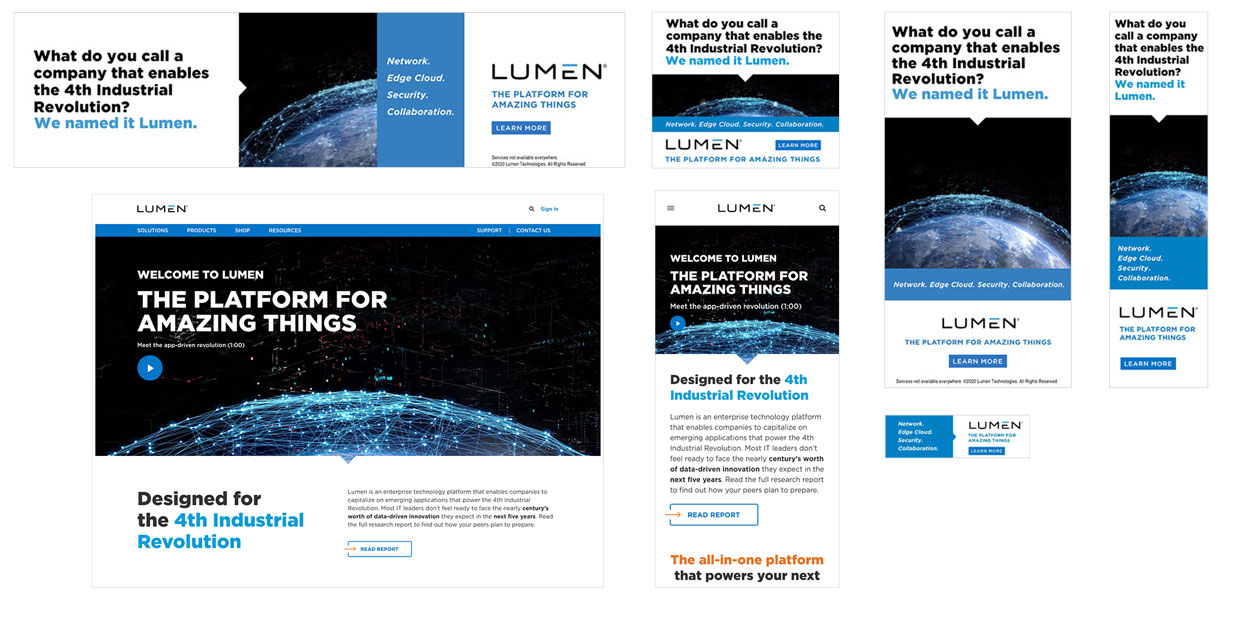
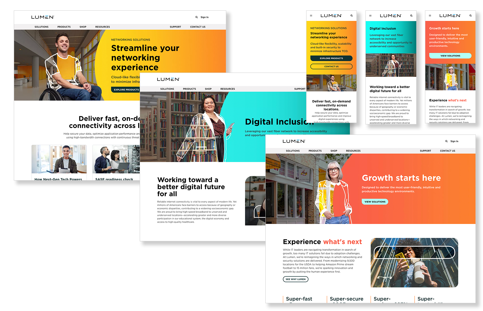
I approached production strategically, starting with highest-priority pages—Home, Solution pages and popular Product pages. These received the most immediate attention and the most work, with full-page mockups in Adobe XD. From there, I scheduled remaining pages, simplifying some to just collections of images and text.
The homepage was beautiful—literally featuring an image of the world that made us look BIG and global.
Solution pages were stunning, with large web heroes covering industries (i.e. healthcare, retail) and specific enterprise challenges (i.e. security). With a large hero image similar in size to the homepage, these featured interactive elements that my team designed, extending our icon system with custom illustrations.
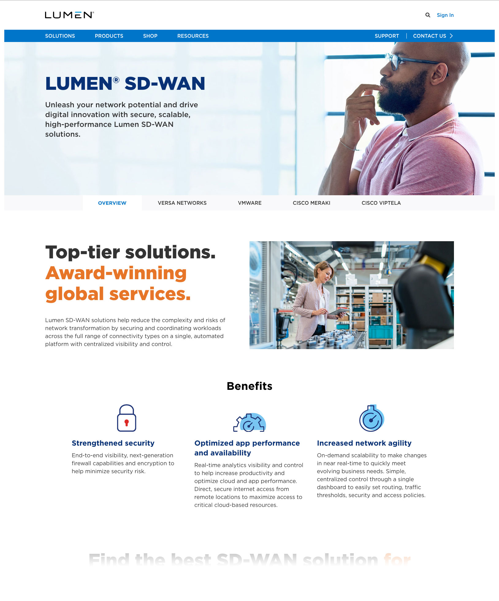
Product pages had to find the right balance between information and style, especially the hero image. It had to accommodate long and short copy (the Copy Team was a wonderful partner), work with all sorts of background images and always be clearly legible, and elegantly shift from desktop to tablet and mobile devices. (Senior leadreship preffered reviewing desktop first, so we had to plan for all viewports with every design).
Before launch, I worked with the dev team to mobilize our entire creative team to test the site off our test server. We checked that pages looked as designed: image and text placement and size, button functionality, interactive elements working as expected, no overallping elements or strange spacing. We also tested tablet and mobile, but only in emulation mode since IT wouldn't approve VPN installation on our personal devices.
We found nothing major. Sure, there were a few clipped or missing images, some incorrect padding, and occasional wrong text sizes, mostly the result of wrong styles being applied which was easy to fix. No major site-wide issues.
The rebrand successfully shifted perception and established Lumen as a technology leader:
78% of ITDMs surveyed said they were familiar with Lumen, including 86% of C-Level ITDMs
48% of ITDMs considered Lumen a technology company vs. 30% for CenturyLink
86% of campaign-aware C-Level ITDMs are likely to consider purchasing from Lumen vs. 53% for non-aware
Internal Recognition:
The familiarity rate came from factors I drove:
The "telecom to technology" perception shift resulted from design decisions I championed:
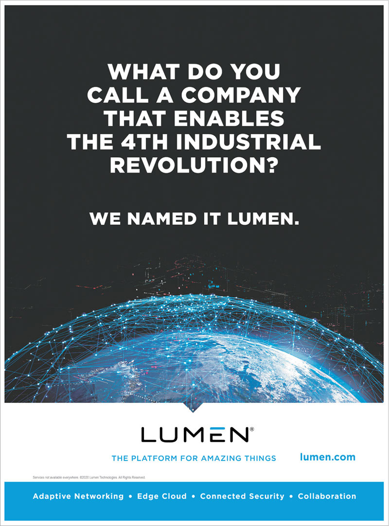
Full-page New York Times advertisement announcing the Lumen launch
Seeing our full-page New York Times ads was significant, as was seeing our TV commercials air.
There were many "We did this!" moments among the team—it felt great to leave the "dark, old" CTL look behind and finally talk openly about Lumen instead of "Project Larry."
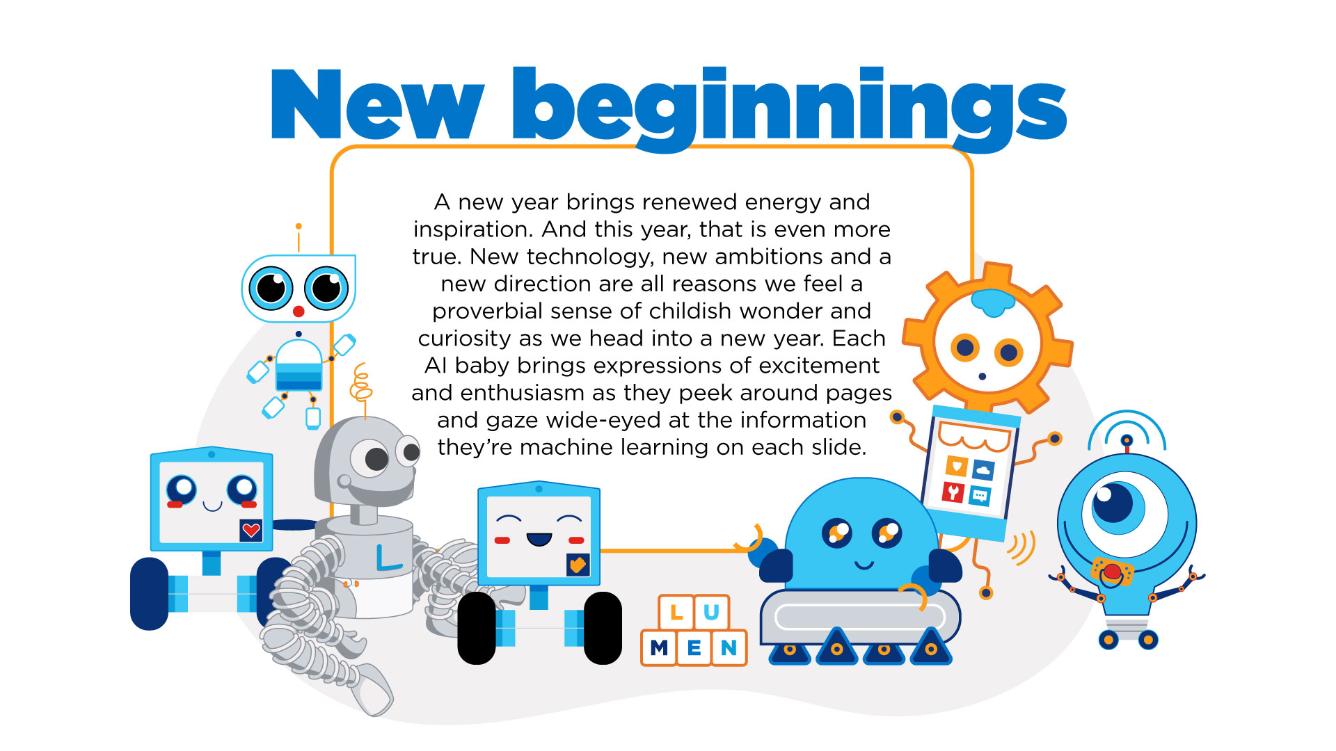
Baby Lumen: Shortly after launch, someone shared an image of Disney corporate material featuring Grogu (aka "Baby Yoda") from The Mandalorian. I loved the idea and asked the team to create "Baby Lumen." The team responded with incredibly cute custom robot illustrations that we turned into a Design Team image used to welcome new people or help colleagues celebrate new babies in their families.
The team was so proud of this work! One person even made holiday ornaments featuring web design patterns and cards (complete with "Lorem ipsum" placeholder text), and another created a custom celebratory illustration for a coworker in the Lumen style and colors.
Bringing 90% of creative work in-house (reducing annual agency spend by $10 million) made us incredibly agile creatively. We focused on reality—how products and services would actually be used—rather than just aiming for "done" or "cool."
This agility proved crucial when we realized messaging like "The 4th Industrial Revolution" and "platform for amazing things" didn't fit what we actually offered or what people were looking for. We adapted quickly.
Lumen 1.5/2.0 (2021-2022): A copy lead and I directed what we called "Lumen 1.5"—course corrections rather than a full redesign. This included removing the notch, taming headline color combinations, developing an illustration style, and refining the overall system.
Lumen 3.0 (End of 2023): After the company settled into major changes, the new leadership team asked for "Lumen 3.0" to really make it their own. For this redesign, the creative team became broader with more managers. While I was an active contributor, I was one of many defining this new style. A primary Lumen Orange color, gradients and "sketched element" came from 3.0 exploration.
Messaging Evolution: "4th Industrial Revolution" and "platform for amazing things" to (several years of no clear singular message) to "The Trusted Network for AI"
I'm particularly proud of how I worked respectfully to help the dev team solve challenges and build a collaborative relationship where, a few years later, we had hearty and honest retrospectives to fix what went wrong and celebrate what went right.
And it all shipped on time, looked great, and did exactly what I designed it to do.